


Inside the design of our brand identity
Six years ago, Digivizer started with the vision of helping businesses of all shapes and sizes create better experiences for their customers by knowing more about people, what they care about and making these insights real-time and actionable.
Going from a bootstrapped startup in a tiny office in Manly to an established presence working with some of Australia’s leading brands, we’ve proved our approach works. Now we want it to scale.
We want to make the best of our technology and insights available to every business, anywhere in the world.
Today, we’re introducing a new logo and brand identity reflecting this next stage of our growth and giving us the toolkit we need to deliver more sophisticated and delightful experiences through our digital products and social channels.
Our team managed the rebranding in-house, collaboratively designing and delivering all aspects of the identity end-to-end.
Designing our future
Modern branding is about experiences first. At this point in our company story, we needed an identity that was more than just a refresh. To get this right across all our products and services, we first had to reflect on how we make decisions.
We started by running a company-wide workshop, diverging, converging and dot voting to form a set of core values that reflect our talent, experiences and focus on scale, leadership, transparency and lean processes.
All these words and ideas came directly from the team.
Collaboratively defining our values gave us the confidence to push for a more ambitious and adaptable design system that addresses the unique requirements of our day-to-day work.
The identity brief
Digivizer has subtly challenging identity requirements because of the volume and diversity of content and data that we publish on a regular basis.
Screen first. Digital devices are the primary medium where our work is displayed. Our product UIs, data visualisation and reports all have very specific constraints for communication design.
Social media friendly. Like the proverbial shoes of the cobbler’s children, we’ve always been so focused on helping our clients succeed in social that we hadn’t applied the same attention to detail to our own presence. Everything we do visually should work seamlessly with the guidelines and conventions of mainstream social channels.
Vibrant and fun. Reflecting the brightness and intensity of our character and ensuring that everything we produce is easy to read and beautiful to look at.
Finding our niche. We need to look like a social technology company to help potential new customers quickly understand who we are and what we do. At the same time, we need to reinforce our uniqueness and personality with a distinct flavour and style.
Making our mark
Our new logo embodies our clarity of purpose and our commitment to the future.
Conversations have always been at the core of what we do, whether it’s connecting businesses to their audiences through creating and leveraging engaged communities, or helping businesses understand what conversations they should be having with their customers.
Our new logo mark takes a fundamental shape from our previous logo — the speech bubble — and recontextualises it in relation to who we are and where we want to be.
Typographically speaking
One of the earliest decisions we made in the design process was to adopt Source Sans Pro as our typeface family.
It brings clarity and consistency to documents and presentations, helping people who aren’t specialised in design achieve better results, and its legibility at small sizes make it ideal for user interfaces.
A colourful accent
After a lot of iteration, we converged on a bright primary blue which achieves the vibrant, fun aesthetic we’re after.
The mnemonic “Best Best Friends Friends” makes this easy to remember.
Working from this primary base, we defined a series of accent colours to better serve the varied work that we do.

This palette serves a range of purposes across multiple contexts, from data visualisation and product design to marketing illustrations.
We’ve put these colours to use on our new website and you’ll see them rolling out in our product UIs and data visualisations over the next few weeks.
Personality clouds
We might be focused on designing screen-first, but we also wanted to introduce a more traditional creative touch.
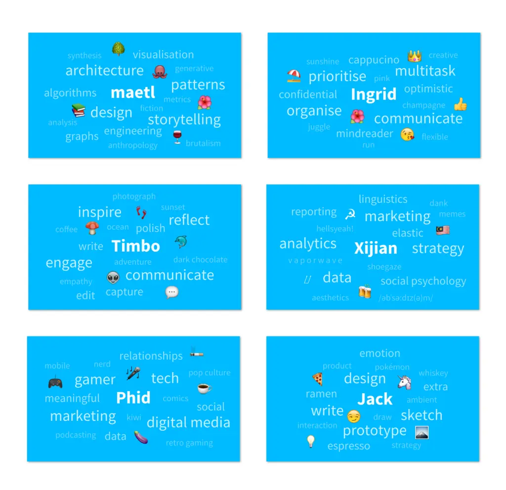
To make our business cards, each member of our team choose a weighted list of words to describe themselves and their work, including five emoji.
It’s “business at the front; party at the back.”
The personality cloud of our CEO, Emma Lo Russo
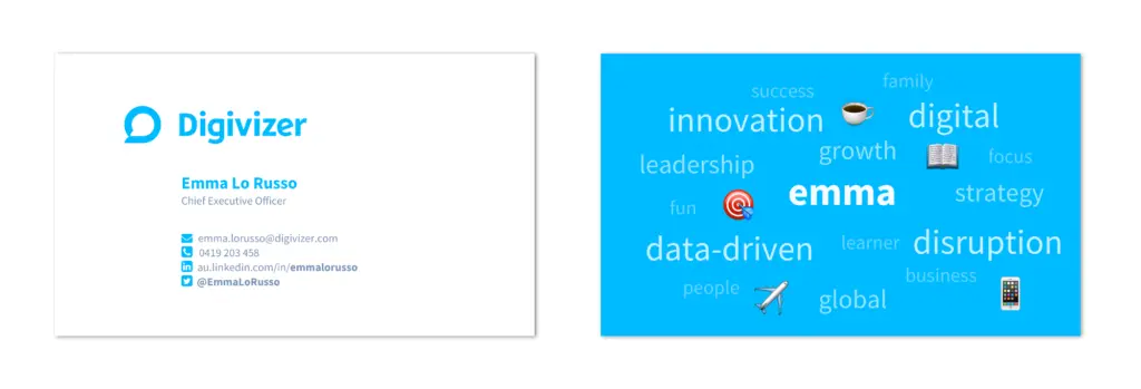
Instantly, the receiver of a Digivizer business card will get a snapshot of the person they are talking to.
Here are a few choice cuts from the team:
Settling into our new space
Several months ago, we moved into larger premises at 11/60 Carrington St, Sydney. This week, we really made the space our own.
Our Office Manager Ingrid taking care of business, as usual.
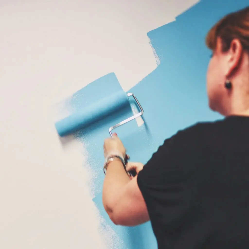
Our office finally feels like we’ve settled in.

Improving every day
We’re extremely happy to be rolling out this new brand identity today. We’re confident it will be a huge asset for the company, giving us the tools we need to continuously improve and create better experiences and outcomes for our customers.
#TeamDigi

If you want to know more about Digivizer and the work we do, drop us a line at info@digivizer.com


